Visualizing the data for EDA#
Visualizations are an excellent start to explore data and see relationships between input features.
They provide an intuitive and easily digestible way to explore complex datasets and identify patterns and relationships between input features. Through visualizations, we can identify trends, outliers, and correlations that might only be apparent after traditional statistical analysis. Whether plotting scatterplots, histograms, or heatmaps, visualizations enable us to gain a deeper understanding of the data and help us communicate our findings effectively to others.
Therefore, visualizations are an excellent starting point for any data analysis project. They can serve as a powerful tool for discovering insights and unlocking the potential of data.
How To#
import pandas as pd
import seaborn as sns
df = pd.read_csv("data/housing.csv")
df.head()
| longitude | latitude | housing_median_age | total_rooms | total_bedrooms | population | households | median_income | median_house_value | ocean_proximity | |
|---|---|---|---|---|---|---|---|---|---|---|
| 0 | -122.23 | 37.88 | 41.0 | 880.0 | 129.0 | 322.0 | 126.0 | 8.3252 | 452600.0 | NEAR BAY |
| 1 | -122.22 | 37.86 | 21.0 | 7099.0 | 1106.0 | 2401.0 | 1138.0 | 8.3014 | 358500.0 | NEAR BAY |
| 2 | -122.24 | 37.85 | 52.0 | 1467.0 | 190.0 | 496.0 | 177.0 | 7.2574 | 352100.0 | NEAR BAY |
| 3 | -122.25 | 37.85 | 52.0 | 1274.0 | 235.0 | 558.0 | 219.0 | 5.6431 | 341300.0 | NEAR BAY |
| 4 | -122.25 | 37.85 | 52.0 | 1627.0 | 280.0 | 565.0 | 259.0 | 3.8462 | 342200.0 | NEAR BAY |
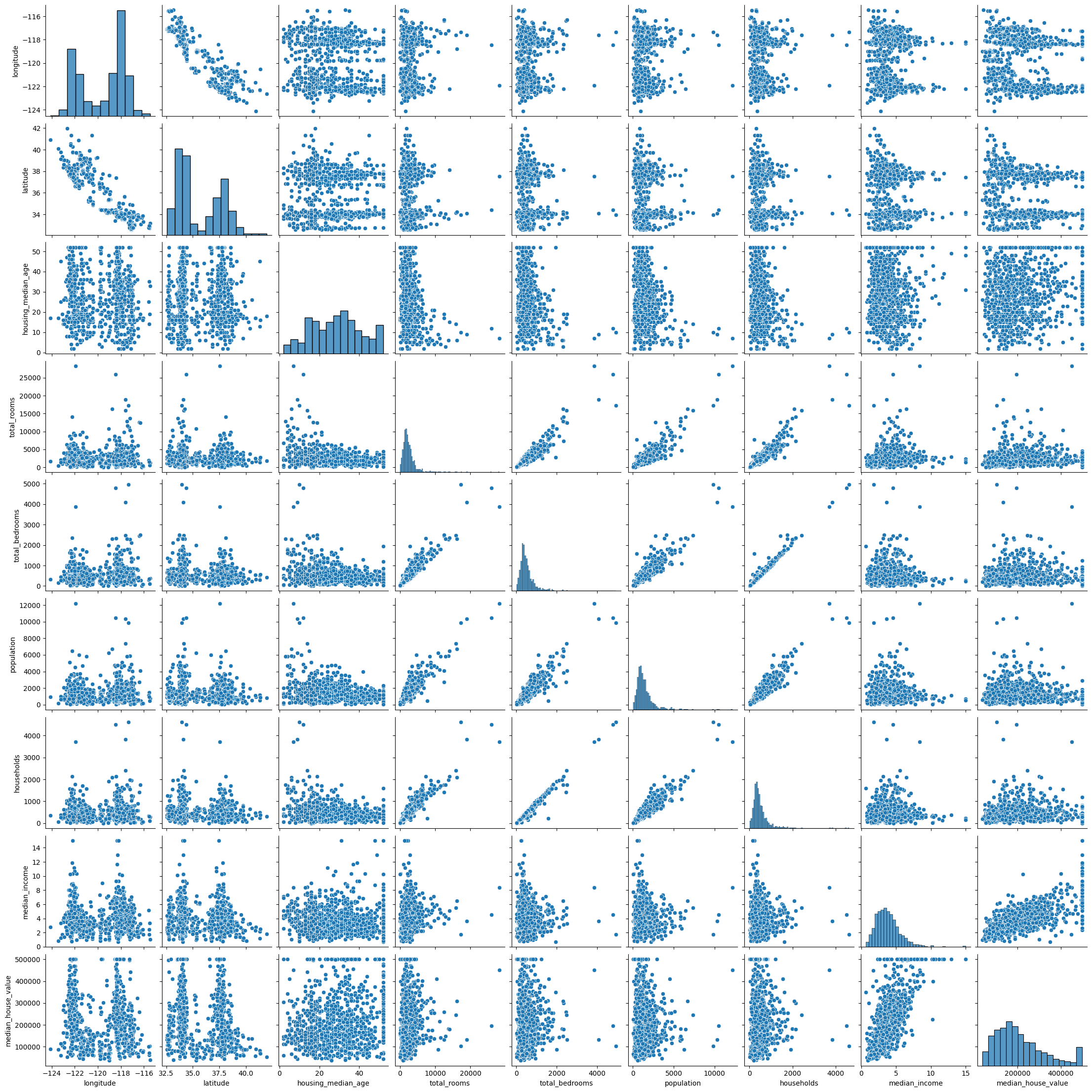
sns.pairplot(df.sample(1000))
<seaborn.axisgrid.PairGrid at 0x7f9eb6965940>
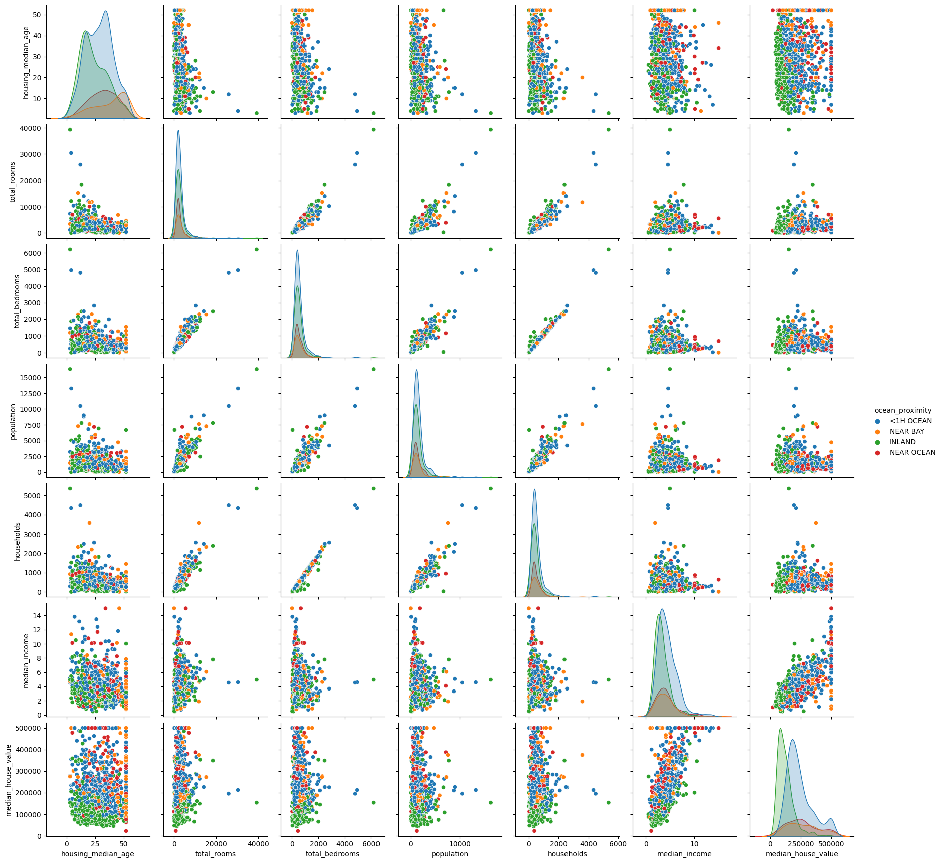
sns.pairplot(df.sample(1000).drop(["latitude",
                                   "longitude",], axis=1),
             hue="ocean_proximity")
<seaborn.axisgrid.PairGrid at 0x7f9f04238850>
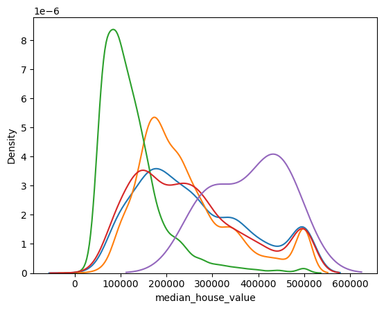
for cls in df.ocean_proximity.unique():
    sns.kdeplot(df[df.ocean_proximity==cls].median_house_value, label=cls)
sns.jointplot("households", "total_bedrooms", df)
---------------------------------------------------------------------------
TypeError                                 Traceback (most recent call last)
Cell In[6], line 1
----> 1 sns.jointplot("households", "total_bedrooms", df)

TypeError: jointplot() takes from 0 to 1 positional arguments but 3 were given
sns.jointplot("population", "total_bedrooms", df, kind="reg")
---------------------------------------------------------------------------
TypeError                                 Traceback (most recent call last)
Cell In[7], line 1
----> 1 sns.jointplot("population", "total_bedrooms", df, kind="reg")

TypeError: jointplot() takes from 0 to 1 positional arguments but 3 positional arguments (and 1 keyword-only argument) were given
sns.jointplot("households", "total_bedrooms", df, kind="reg")
---------------------------------------------------------------------------
TypeError                                 Traceback (most recent call last)
Cell In[8], line 1
----> 1 sns.jointplot("households", "total_bedrooms", df, kind="reg")

TypeError: jointplot() takes from 0 to 1 positional arguments but 3 positional arguments (and 1 keyword-only argument) were given
sns.heatmap(df.corr(), square=True)
---------------------------------------------------------------------------
ValueError                                Traceback (most recent call last)
Cell In[9], line 1
----> 1 sns.heatmap(df.corr(), square=True)

File /opt/hostedtoolcache/Python/3.8.18/x64/lib/python3.8/site-packages/pandas/core/frame.py:10054, in DataFrame.corr(self, method, min_periods, numeric_only)
  10052 cols = data.columns
  10053 idx = cols.copy()
> 10054 mat = data.to_numpy(dtype=float, na_value=np.nan, copy=False)
  10056 if method == "pearson":
  10057     correl = libalgos.nancorr(mat, minp=min_periods)

File /opt/hostedtoolcache/Python/3.8.18/x64/lib/python3.8/site-packages/pandas/core/frame.py:1838, in DataFrame.to_numpy(self, dtype, copy, na_value)
   1836 if dtype is not None:
   1837     dtype = np.dtype(dtype)
-> 1838 result = self._mgr.as_array(dtype=dtype, copy=copy, na_value=na_value)
   1839 if result.dtype is not dtype:
   1840     result = np.array(result, dtype=dtype, copy=False)

File /opt/hostedtoolcache/Python/3.8.18/x64/lib/python3.8/site-packages/pandas/core/internals/managers.py:1732, in BlockManager.as_array(self, dtype, copy, na_value)
   1730         arr.flags.writeable = False
   1731 else:
-> 1732     arr = self._interleave(dtype=dtype, na_value=na_value)
   1733     # The underlying data was copied within _interleave, so no need
   1734     # to further copy if copy=True or setting na_value
   1736 if na_value is not lib.no_default:

File /opt/hostedtoolcache/Python/3.8.18/x64/lib/python3.8/site-packages/pandas/core/internals/managers.py:1794, in BlockManager._interleave(self, dtype, na_value)
   1792     else:
   1793         arr = blk.get_values(dtype)
-> 1794     result[rl.indexer] = arr
   1795     itemmask[rl.indexer] = 1
   1797 if not itemmask.all():

ValueError: could not convert string to float: 'NEAR BAY'
sns.heatmap(df.corr().abs().round(1), square=True, annot=True)
---------------------------------------------------------------------------
ValueError                                Traceback (most recent call last)
Cell In[10], line 1
----> 1 sns.heatmap(df.corr().abs().round(1), square=True, annot=True)

File /opt/hostedtoolcache/Python/3.8.18/x64/lib/python3.8/site-packages/pandas/core/frame.py:10054, in DataFrame.corr(self, method, min_periods, numeric_only)
  10052 cols = data.columns
  10053 idx = cols.copy()
> 10054 mat = data.to_numpy(dtype=float, na_value=np.nan, copy=False)
  10056 if method == "pearson":
  10057     correl = libalgos.nancorr(mat, minp=min_periods)

File /opt/hostedtoolcache/Python/3.8.18/x64/lib/python3.8/site-packages/pandas/core/frame.py:1838, in DataFrame.to_numpy(self, dtype, copy, na_value)
   1836 if dtype is not None:
   1837     dtype = np.dtype(dtype)
-> 1838 result = self._mgr.as_array(dtype=dtype, copy=copy, na_value=na_value)
   1839 if result.dtype is not dtype:
   1840     result = np.array(result, dtype=dtype, copy=False)

File /opt/hostedtoolcache/Python/3.8.18/x64/lib/python3.8/site-packages/pandas/core/internals/managers.py:1732, in BlockManager.as_array(self, dtype, copy, na_value)
   1730         arr.flags.writeable = False
   1731 else:
-> 1732     arr = self._interleave(dtype=dtype, na_value=na_value)
   1733     # The underlying data was copied within _interleave, so no need
   1734     # to further copy if copy=True or setting na_value
   1736 if na_value is not lib.no_default:

File /opt/hostedtoolcache/Python/3.8.18/x64/lib/python3.8/site-packages/pandas/core/internals/managers.py:1794, in BlockManager._interleave(self, dtype, na_value)
   1792     else:
   1793         arr = blk.get_values(dtype)
-> 1794     result[rl.indexer] = arr
   1795     itemmask[rl.indexer] = 1
   1797 if not itemmask.all():

ValueError: could not convert string to float: 'NEAR BAY'
Exercise#
Explore the data further, maybe try a bar chart!